3 Ways Good Design Makes You Happy
Great design doesn’t just look good. It makes you feel something.
This is the central argument put forward by renowned researcher Don Norman. His work on Emotional Design is just as relevant as it was when it was published in 2004. He proposes that there are three key levels to great, evocative design — visceral, behavioural and reflective.
While typography, visuals and copy all go into designs that make you happy — we want to look closer at the science of why some designs delight where others fail. It’s time to leave your logical brains behind and focus on the emotions.
Gut Reaction
Have you ever seen a piece of art that makes you furious?
We all have gut reactions to things we see in our lives. We can find a misshapen apple oddly amusing, a TV interface endlessly frustrating or a boxy car worth pointing out to a friend. It’s our gut reaction.
This is visceral design. It’s the realm of the subconscious and covers beauty, feel, and that immediate gut reaction to a design. It asks why we have these base reactions to certain designs. It is not just about making a design look attractive, but inspiring delight and excitement. It’s the perfect mix of colour, typography and art design that makes you think wow. We think it feels a little like love at first sight.
Take the latest release of the new iMac. It’s hard not to be delighted by the colours. They invoke the memory of the old plastic-cased iMacs from our childhoods (or first jobs) combined with a sleek new design. Something as simple as a computer is now a portal to a brand new creative frontier. It leaves us with an overwhelming feeling of happiness. Just by using colour. Now that’s a sneakily clever design.
Make It Easy
The behavioural tier of design theory covers how we use the design.
Another way of describing this is useability. The key idea is that not only should a design look good — it should also work. It’s through the useability of a design that we build trust. How many times have you opened an app or website and found it difficult to navigate? You don’t stay to try and figure it out, you simply go somewhere else. If you find it easy to use — you’re much more likely to use it again.
When it comes to branding, the behavioural element is key. It’s about functionality, useability and performance. We know when something works and we instinctively feel when it doesn’t.
Norman gives the example of the feeling of control and safety when taking a sports car around a tight bend. When it comes to design — it’s a similar emotion. Great design inspires trust.
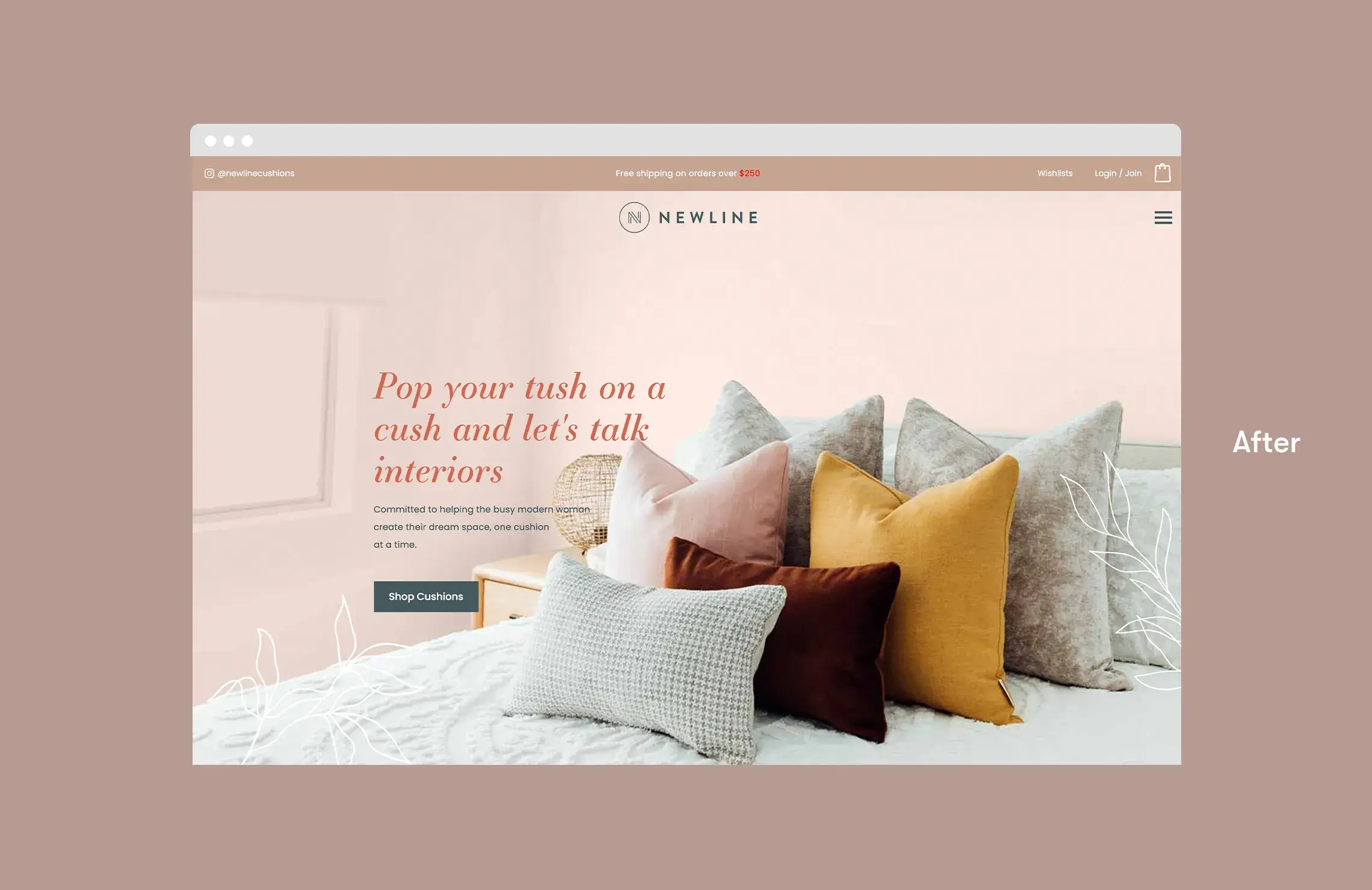
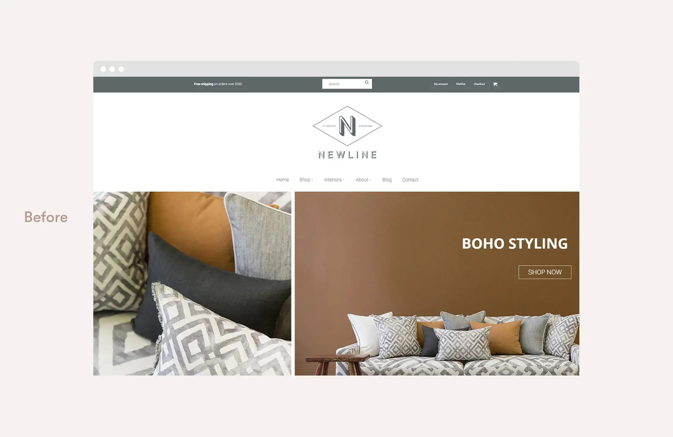
Take a look at our recent work for our client Newline Cushions. Everything from the font, to the colours and copy work in perfect harmony to create a soft, welcoming persona. It’s not just a website home page — but an emotional hook for a potential customer.
Take a look at our recent work for our client Newline Cushions. Everything from the font, to the colours and copy work in perfect harmony to create a soft, welcoming persona. It’s not just a website home page — but an emotional hook for a potential customer.
This or That?
You’re faced with a choice.
You can either buy a simple watch or a beautiful one. They both tell the time. They both look the same. But for a lot of us — we reach for the nice-looking watch.
It’s not just about status but rather the culmination of both visceral and behavioural design. It’s the usefulness combined with joy. Why have something that just does the job when you can have something brilliant?
This is the realm of reflective design. It includes that feeling of delight. It’s the ah-ha of finding something that works perfectly as intended and then excitedly telling a friend about it. The feeling of pride you take when you encounter a particular design. At the core — it’s about self-expression.
This is the ultimate goal of any design. To delight and inspire. It creates action.
Do you want to engage a team of designers that love to create emotive branding? Contact Bellman today.


